



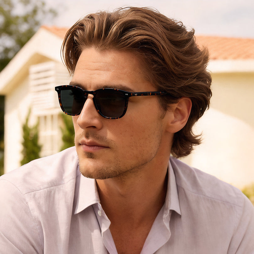
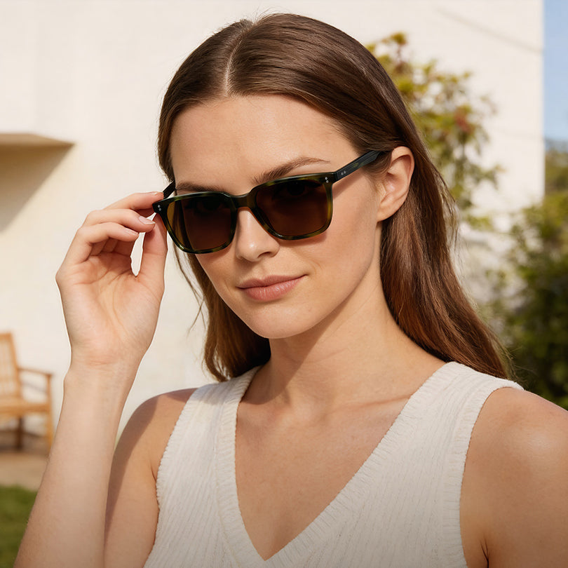



Black, Beige or Tortoise: How Frame Colour Changes a Pair
Colour is the first thing anyone notices about a pair of glasses and the last thing most buying guides explain. It is usually treated as taste. In practice it behaves like a fit variable: the same frame in black and in translucent gold sits on the same face with the same measurements and reads as a different object.
There is a structural reason for that in our range, and it is worth knowing before you shop. Every colour is its own product listing, not a dropdown on one page — so a single model can exist as eight or nine separate listings that look, at a glance, like eight or nine different frames. The eyeglasses collection is where to see the shapes those listings belong to.
What colour actually changes
- Perceived weight. A dark frame reads heavier than a light one at identical dimensions, because contrast against the face draws the eye to the rim first.
- Where the eye lands. High contrast pulls attention to the frame; low contrast lets the eye go to your face. Neither is better — but one of them is usually what you wanted.
- Formality. Black and deep tortoise read formal and photograph predictably. Translucent and pale frames read casual and photograph inconsistently.
- How the frame ages. Dark acetate shows scratches and dust; translucent shows internal colour and small imperfections, which some people read as character and others as damage.
The five colourways in our best-seller list
| Model | Colour on this listing | Colourways for this model |
|---|---|---|
| Kenosha-FL20 | Black | 8 |
| Concord-FL13 | Beige | 9 |
| Downey-FL04 | Tortoise | 7 |
| Blivier-FL02 | Translucent gold | 3 |
| Mathew-FC06 | Transparent grey | 3 |
Those last two columns are the practical point. Concord exists in nine colourways and Blivier in three: if you like a shape, there is usually more than one colour available, but you will not find them on the same page. Search the model name rather than the colour, then look at what comes back. Almost all of them are acetate, which is why the acetate eyeglasses range is where colour is usually chosen.
Five frames, five different colour arguments

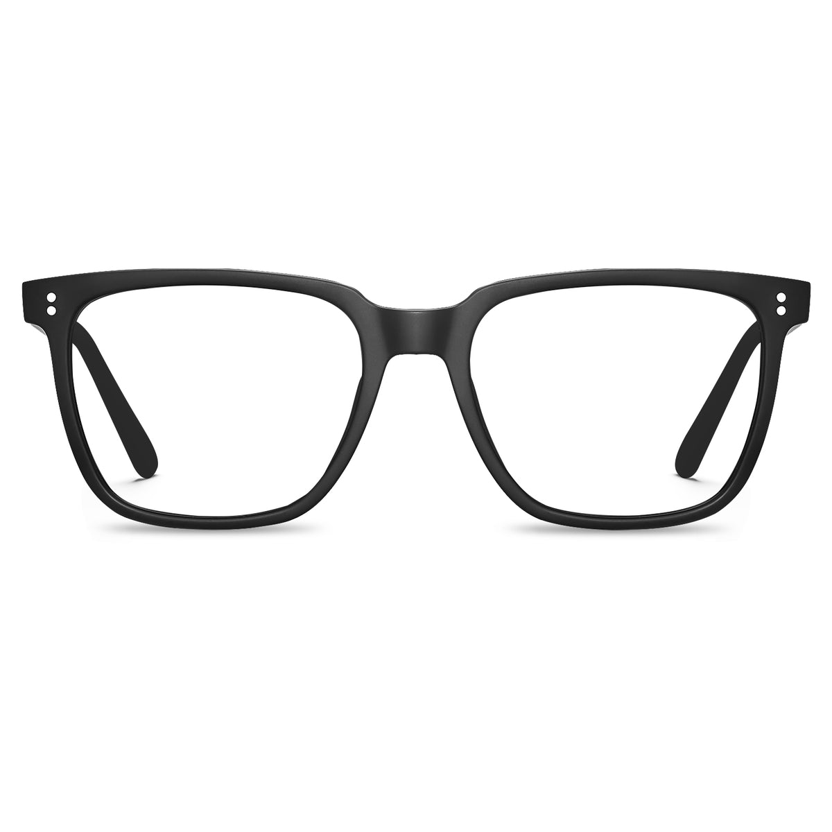
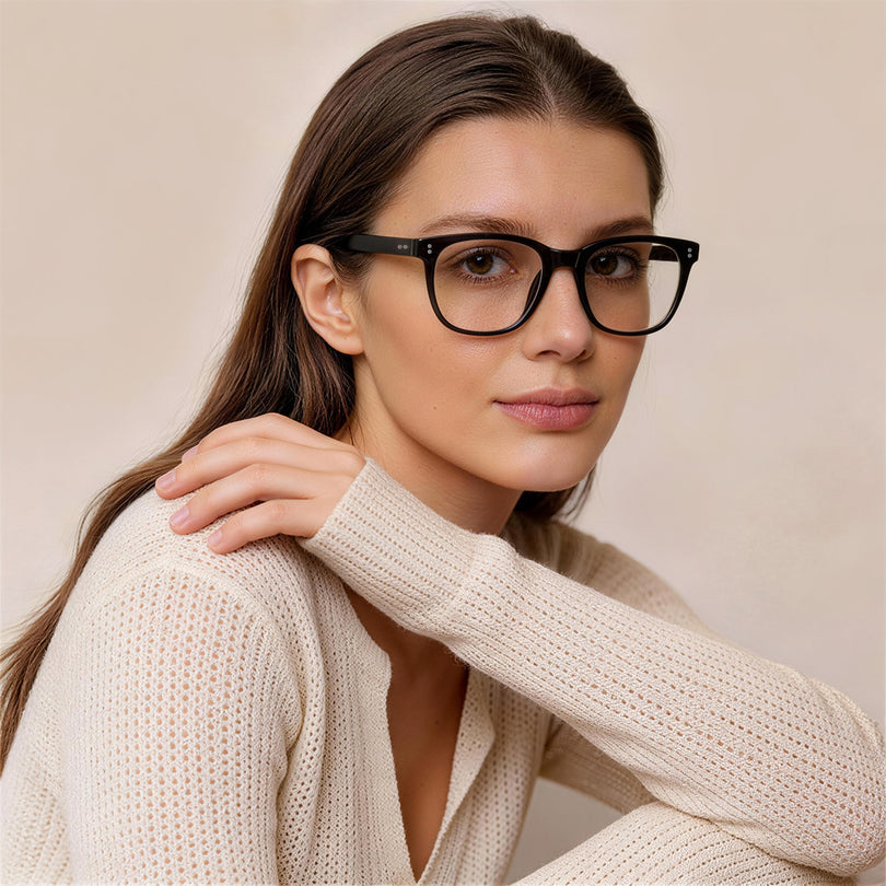
Black acetate with stud detailing, in the model with the most colourways we sell — eight. If you want to know what a shape looks like before committing to an unusual colour, start here.
Frame width 142 mm · Lens 52 × 41 mm · Bridge 19 mm

Beige, on the model with nine colourways. Pale acetate is the least demanding colour to wear daily: it lowers the contrast between frame and skin, so the frame stops being the first thing people see.
Frame width 142 mm · Lens 50 × 44 mm · Bridge 22 mm

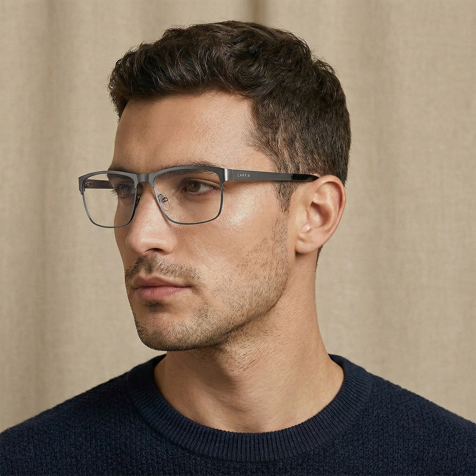
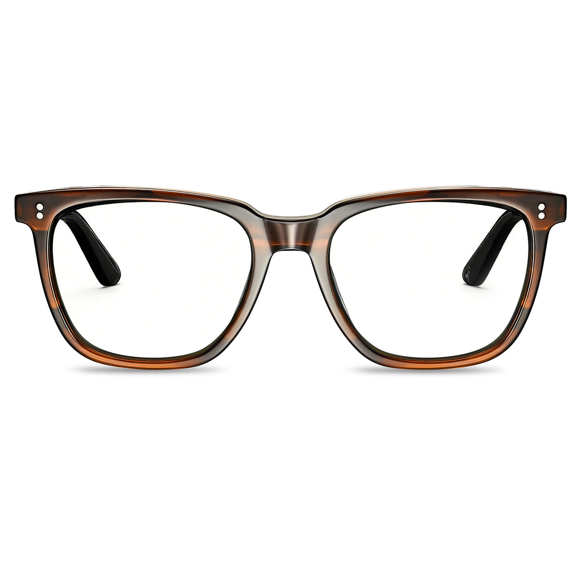
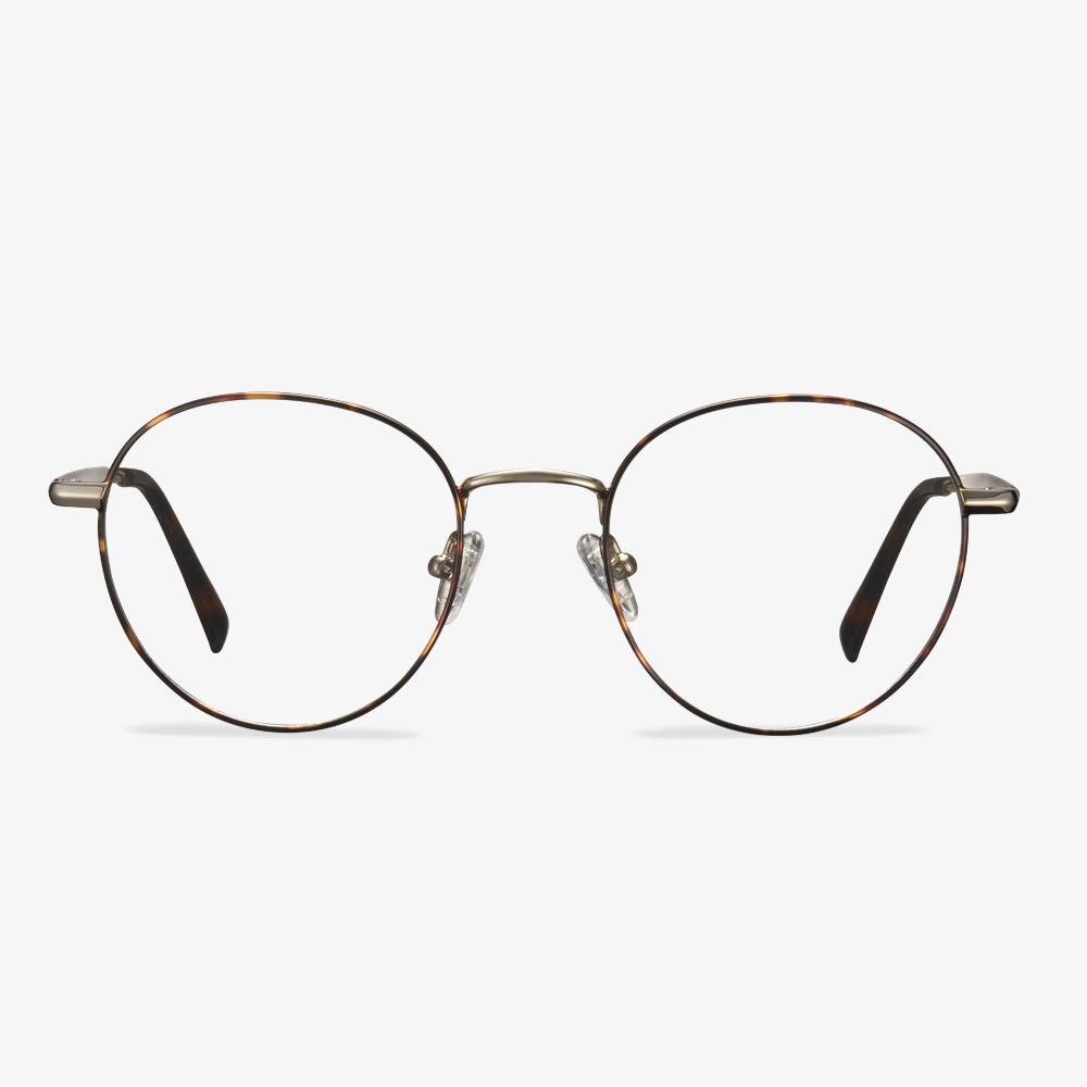
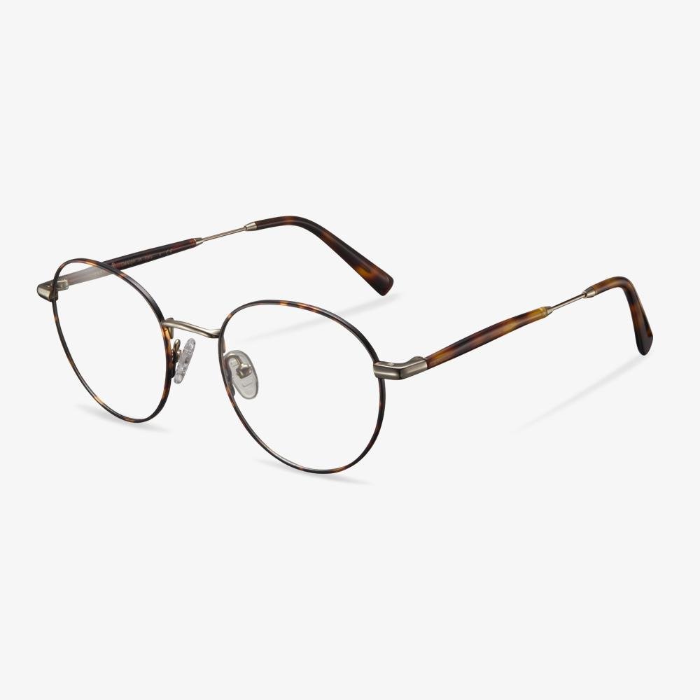
Tortoise — and tortoise is the one colour that is never quite repeatable. Acetate is poured in sheets, so the pattern on your pair is not the pattern on the product photo, or on anyone else's pair.
Frame width 140 mm · Lens 50 × 43 mm · Bridge 19 mm

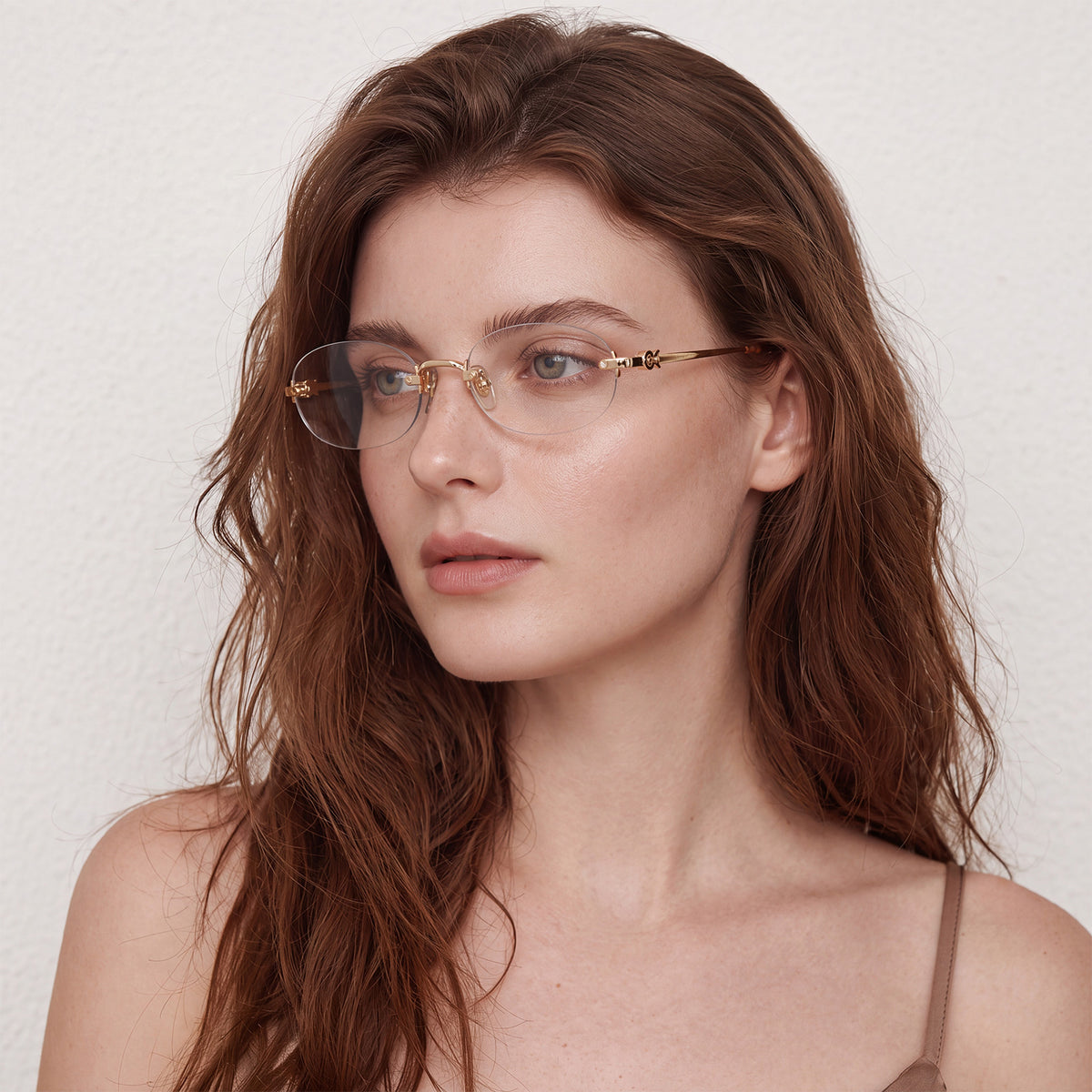
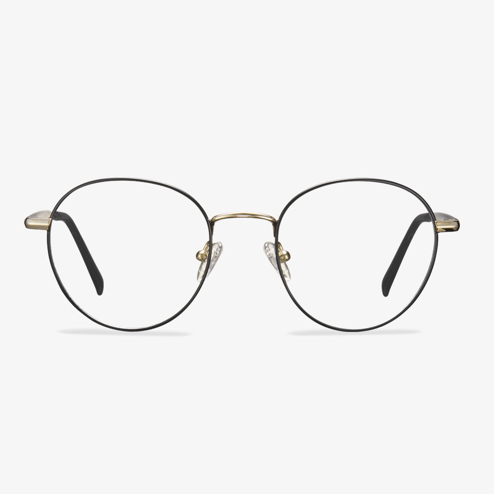
Translucent gold, which behaves like neither a metal nor a solid acetate. In daylight it picks up the colour of what is behind it; indoors it reads closer to champagne.
Frame width 142 mm · Lens 50 × 44 mm · Bridge 22 mm

Transparent grey in an oversized shape. Transparency is what keeps a large frame from looking heavy — the same silhouette in solid black would be a much louder pair of glasses.
Frame width 142 mm · Lens 55 × 40 mm · Bridge 17 mm
Tortoise is not a colour, it is a process
Most frame colours are pigment mixed into acetate. Tortoise is a pattern suspended in it: two or more colours poured together and pressed into a sheet, so no two cuts are identical. That is not a manufacturing flaw to be managed, it is the reason the colour exists. How the sheet itself is made, and why it changes the feel of a frame, is covered in handmade acetate vs plastic frames.
The practical consequence is that a tortoise frame cannot be colour-matched to a photograph. If exactness matters — buying a second pair to match, or matching a frame to a specific outfit — choose a solid colour. If you want a frame that looks like material rather than paint, tortoise is the one that does. Round frames carry tortoise better than any other shape, and the round eyeglasses in colour guide walks through the combinations.
Matching colour to skin and hair, without the folklore
The usual advice is warm skin to warm frames, cool skin to cool frames. It is roughly right and mostly unhelpful, because most people cannot confidently classify their own undertone, and because contrast matters more than temperature.
A more reliable rule: match the frame's contrast to the contrast you already have. High-contrast features — dark hair, dark brows, strong colouring — carry black and deep tortoise without the frame overwhelming them. Low-contrast colouring — fair hair, soft brows, pale skin — tends to look best in beige, translucent and grey, where the frame sits at a similar contrast level to the face. Pale and translucent options are easiest to compare in the eyeglasses for women range.
- Dark hair, dark brows: black, deep tortoise, dark green.
- Fair or mid-brown hair, soft brows: beige, translucent gold, transparent grey.
- Grey or white hair: tortoise and translucent frames hold contrast against the hair; black can read as a hard line.
- Very light skin with very dark hair: the highest-contrast pairing, which is exactly when a lighter frame is worth considering — not because black looks wrong, but because it will be the only thing people see.
Acetate colour and metal colour are not the same decision
An acetate frame is coloured through its thickness: the colour is the material, so a black acetate rim is black all the way down to the lens groove. A metal frame is coated — the colour is a finish on the surface — so it has a highlight, a sheen and a slight reflection that acetate never has.
That changes how a colour behaves at the same value. A black acetate square reads matte and solid; a grey metal rectangle reads lighter and more technical, because the surface catches light. The same nominal colour on two materials will not look like the same colour, which is the most common reason a frame that looked right on screen looks different in the hand. Lens choice matters here too: an anti-reflective coating removes most of the glare across the lens, which leaves the frame colour as the only thing catching light. Our lens options set out the rest.
How each colour ages
- Black acetate shows dust, fingerprints and fine scratches most clearly, and hides yellowing least well after years of sun.
- Tortoise hides scratches better than any solid colour, because the pattern breaks up the line of a mark.
- Beige and pale acetate shows wear where the frame meets the lens, and shows dust along the top bar.
- Transparent and translucent frames show the internal structure — the core wire, the hinge screws — which is either the point or the problem, depending on what you wanted.
- Metal finishes wear at the same three points on every pair: the nose pads, the temple tips and the hinge, where the finish rubs against skin and hair.
None of this is a reason to avoid a colour. It is a reason to know what you are buying: a translucent frame is a commitment to seeing its insides, and a black frame is a commitment to cleaning it. If you want the colour to work with your face rather than against it, frames for face shapes covers the contrast question properly.
How to test a colour properly
- Stand at a window in daylight, not under a warm bulb. Indoor lighting shifts every colour towards yellow, and translucent frames most of all.
- Hold the frame up so the rim crosses your brow and cheek, not just your eyes — that is where the contrast sits when you wear it.
- Take one photo with the rear camera, no filter, and look at it later. You are checking whether the frame or your face is what you notice first.
- If you are choosing between two, pick the one you would still wear to a meeting. Glasses are worn on ordinary days far more often than on the day you bought them.
A frame you love in a shop and a frame you wear for two years are often different colours. The one that survives is usually the lower-contrast one, because it works with more of what you already own.
The colour decision, in one paragraph
Decide the shape and the fit first — bridge, lens height, frame width. Then use colour to set how much attention the frame gets. Black and deep tortoise are formal and deliberate; beige and grey recede; translucent frames do something in between and change with the light. And check how many colourways the model comes in, because the colour you want probably exists in the shape you want, on a different listing.